iPhone 14 Pro review: Price and availability
The iPhone 14 Pro starts at $999 for the 128GB model, just like last year. Rumors about a price hike proved false, and you won’t catch me complaining about it.
The 256GB variant costs $1,099, 512GB goes for $1,299 and 1TB will run you $1,499. And with all of the video features, you might want the extra storage — the 1080p limit on ProRes video for the 128GB version remains.
I think the Galaxy S22 Plus stands as the best price comparison for the iPhone 14 Pro. Both start at $999, feature top-end screens, powerful cameras, and excellent processors. But other top Android phones cost less than the iPhone 14 Pro, such as the $899 Pixel 6 Pro (which is the iPhone’s chief photography competitor) and the $749 OnePlus 10 Pro.
Apple has a spread of iPhones for you starting at $799 for the iPhone 14, with the iPhone 14 Plus climbing to $899 and the iPhone 14 Pro Max sitting at $1,099.
iPhone 14 Pro review: Design
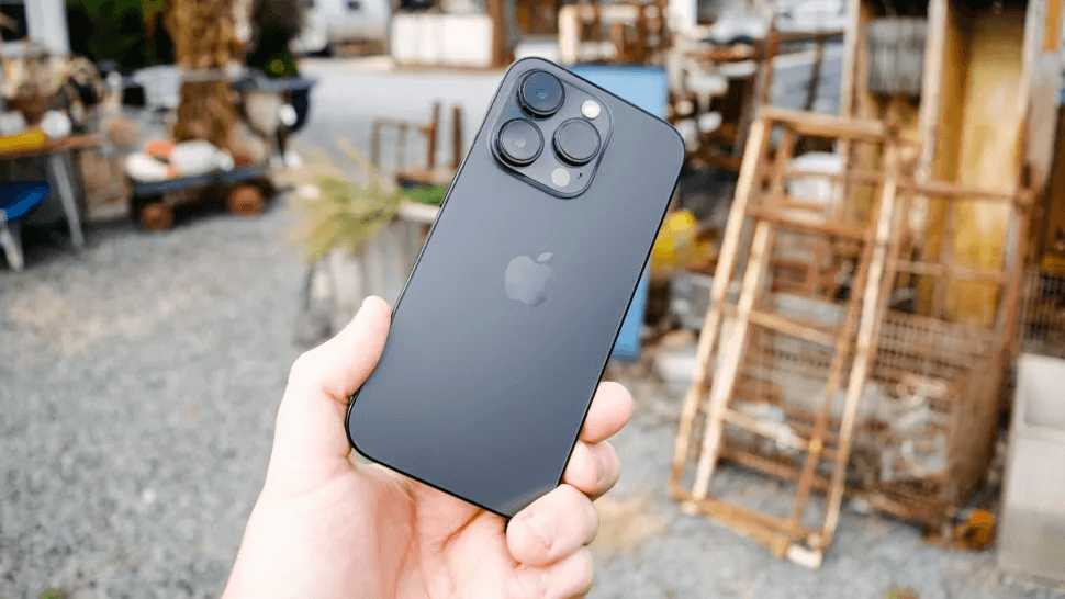
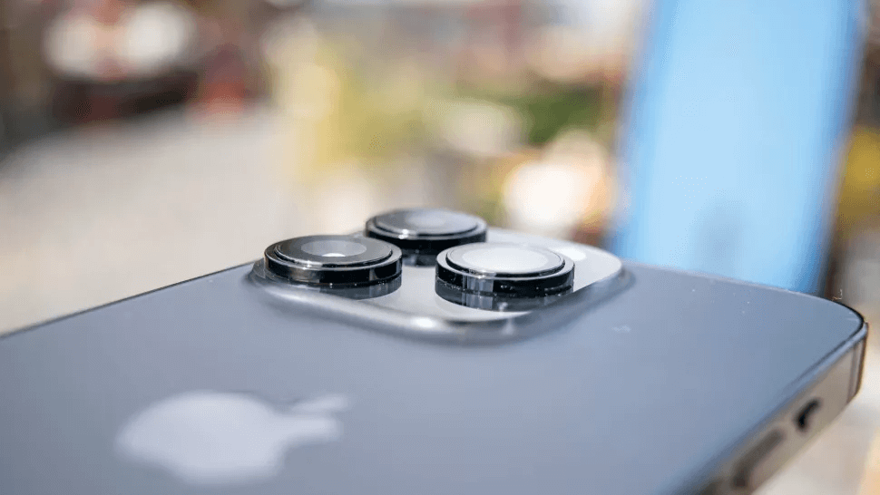
I find the iPhone 14 Pro’s design dichotomous. On the one hand, it looks a lot like the iPhone 13 Pro, just with an even larger camera module. From the back, it might be hard to distinguish this handset from its predecessor unless you look really hard at those lenses — admittedly, they are noticeably larger thanks to the upgrades underneath.

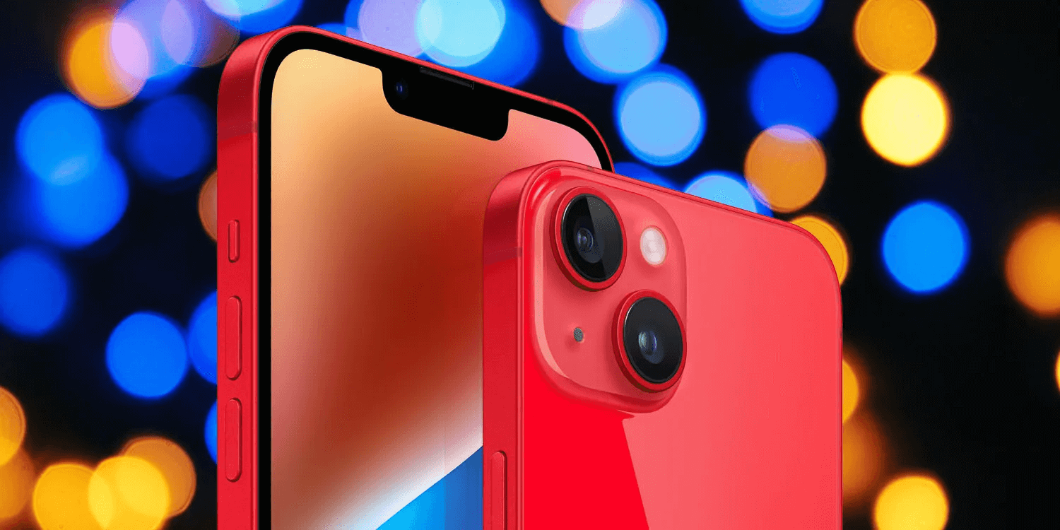
On the other hand, the front of Apple’s new phone looks a lot different. The notch is gone, replaced by the pill-shaped Dynamic Island. The old, tired iPhone design has finally gotten a refresh, though the cutout is still larger than those on the best Android phones because it houses Face ID.

The Dynamic Island is actually pretty interesting. It’s not just a static pill (versus the hole punch on most Android phones). And Dynamic Island expands depending on what you’re doing, displaying animations for many system actions like unlocking, playing music, timers, and so on.

It’ll even turn into a media player if you tap and hold the Dynamic Island while listening to music. In that way, you can access media controls without pulling down the Notification Center.

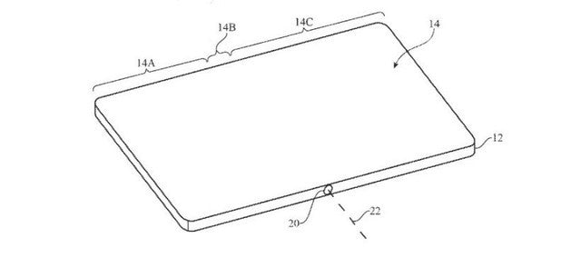
Screen cutouts are here to stay for a while, at least until Apple figures out under-screen Face ID and under-display cameras get way better. But as someone who never truly got used to the notch — and has hated it since its inception — I like the Dynamic Island. Not only does it look better than the notch, it offers actual utility where its predecessor just sat there doing nothing.

The iPhone 14 Pro sports a stainless steel frame with a matte finish on the back glass — which is now removable for easier (but not cheaper) repairs. Apple’s Ceramic Shield coats the screen, providing extra durability. The phone clocks in at 7.3 ounces, a noticeable heft for such a diminutive device. And like the iPhone 13 Pro, the iPhone 14 Pro’s massive camera bump ensures that it does not lay level on a flat surface. This means the phone wobbles if you try to use it while it’s sitting on a table or counter. An iPhone 14 case may help with this.

I’m still not a fan of the squared off edges first introduced on the iPhone 12, but this isn’t the iPhone 14 Pro Max. The iPhone 14 Pro’s more manageable size makes those sharp corners less cumbersome. The lighter weight also helps it not dig into your palm.

I like the iPhone 14 Pro’s new front design, despite my lack of enthusiasm for the same-y back. Apple takes a while to change things up, but this is the third generation of the squared-off look, which is less ergonomic than a curved back. I hope the iPhone 15 goes back to that design, but for now, the iPhone 14 Pro is more of the same in most respects. I just love the death of the notch.
iPhone 14 Pro review: Display
Samsung and Apple typically have the best smartphone displays on their respective handsets. The iPhone 14 Pro continues that trend. In fact, this is the best display I’ve ever seen on a phone. From the punchy colors to the insane brightness both indoors and outdoors, I have never enjoyed looking at a screen more than I do with the iPhone 14 Pro.


The iPhone 14 Pro's display improved slightly over the iPhone 13 Pro's, notably in color reproduction and accuracy. (Delta-E measures that, where 0 is perfect.) It, however, did not hit the 2,000-nit peak outdoor brightness in our measurements, even with a powerful testing equipment.
Returning this year is the 120Hz ProMotion display, able to clock down to 1Hz to save on battery power. That's is also key to the new always-on display.

I watched Blade Runner 2049 all the way through on this display, thrilled with incredible neons, dingy city scenes, and harsh oranges in the latter part of the film. The iPhone 14 Pro offered me the best viewing experience of this movie I’ve had, besting even my gaming monitor and TV. That’s impressive.
Games look equally impressive. Genshin Impact with its saturated palette and anime-styling looked amazing, especially at the higher and smoother frame rates. Other titles like Pascal’s Wager (a gritty Bloodborne-style Souls-like), Dead Cells, and Asphalt 9 all also looked great. Thanks to the display and new chipset, gaming is an absolute treat on the iPhone 14 Pro.
I have no trouble imagining that Samsung will match the iPhone 14 Pro’s display quality when the Galaxy S23 series arrives in early 2024, but other Android phone makers have a huge hurdle to overcome to match this panel.
iPhone 14 Pro review: Cameras
Apple made sure the iPhone 14 Pro got some big camera upgrades this year. Chief among them is the new 48MP quad-pixel main sensor. While not unique to Apple’s phones, the iPhone 14 Pro can take a 12MP image that the phone has adapted to your lighting conditions with the whole sensor, but with four times the detail thanks to the quad pixel setup. If you want, you can get a whole 48MP image in ProRAW, which is wild.

The 12MP ultrawide sensor also saw a boost with a new sensor that’s twice as large as the one on theiPhone 13 Pro. The telephoto lens is still 3x. I had hoped to see at least 4x to match the Pixel 6 Pro, but Apple instead added 2x optical zoom to the main sensor. So you have four zoom options with the ultrawide’s 0.5x, the main lens’ 1x and 2x, and the telephoto’s 3x.
A new feature for iPhones this year is the Photonic Engine, which all iPhone 14 models enjoy access to. It’s basically a new computational photography model that improves mid- and low-light photos by incorporating Apple’s Deep Fusion technology earlier in the pipeline before the frames get compressed. Photonic Engine promises to enhance dynamic range to bring out detail even in low-light pictures.
The selfie camera on the iPhone 14 Pro sees some improvements, too. Autofocus now comes standard, a feature I’ve been wanting to see for some time now. Apple says the TrueDepth camera’s faster aperture will ensure better low-light selfies, which I put to the test below. The front-facing camera also gets access to the Photonic Engine.
I pulled out the iPhone 14 Pro’s biggest camera rival, the Pixel 6 Pro, to see how these changes translate to actual photos.

Starting off with this shot of a produce stand, the race is extremely close. In fact, it’s difficult to tell the difference between the two photos. Colors are vibrant in both shots, especially the purple eggplants and red tomatoes. However, looking at the iPhone 14 Pro’s image, you can see it’s a bit brighter than the Pixel 6 Pro’s. The reflections in the tomatoes are more prominent, whereas the Pixel dialed things down a bit too much.
Both have a strong natural look, but I find the iPhone 14 Pro more accurately captures the scene as I saw it.

Staying outside with this photo of some signs and colored boards, both phones are once again neck and neck. I noticed that the Pixel 6 Pro’s shot is a bit dimmer since it was an overcast day, an effect I like better than the iPhone 14 Pro’s over-brightening. In the latter’s case, I think the colors got a wee bit too washed out, whereas they look more accurate in the Pixel’s picture. So the Pixel gets the win in this one.

Heading inside to this room with copious amounts of natural light, I found the same to be true as the comparison we just looked at. Both the iPhone 14 Pro and Pixel 6 Pro produced beautiful images of this table with some pumpkins. All of the colors look properly autumn-like and I find either shot warm and welcoming. That said, I think the iPhone cranked up the exposure more than necessary. The colors look a bit deeper in the Pixel’s photo, as do the shadows in the background.
For this first indoor test, I think the Pixel 6 Pro comes out on top with richer colors and better exposure control.

Looking at this bookshelf in my living room, the two photos are nigh indistinguishable. Considering the dark day and harsh artificial light, both phones performed admirably. The iPhone is a tad brighter than the Pixel, but I don’t see any washed out colors. I can easily read all of the book spines, too. My one nitpick is that the orange joycon down on the left looks more accurate in the Pixel’s picture, but overall, I can’t pick one as better than the other here.

For all of its improvements with lighting, I think the iPhone 14 Pro’s ultrawide camera goes a bit overboard. Looking at this scene, I see some of the colors off. For example, the pumpkins in the foreground look slightly too saturated, but the ones on the table look almost too overexposed. It’s a strange image and not something I really noticed on the phone’s display while out photographing.
Look at the Pixel 6 Pro’s ultrawide shot in comparison — there’s a slight difference because the Pixel is 0.7x versus the iPhone 14 Pro’s 0.5x. The colors are toned down and more accurate to my eye. There’s a ton of detail, but also a sense of softness where needed. The lighting is also just better. I don’t get the sense that the Pixel strayed too bright.

Heading up to the upper end of either phone’s optical zoom, here’s the same building at 3x for the iPhone 14 Pro and 4x for the Pixel 6 Pro. I think the iPhone’s shot looks a bit better than the one previously. Colors are more in check and the exposure controls appear more in line with what I’d like to see.
That’s not to say that the Pixel is any worse. This 4x photo is very good. Colors are incredibly accurate, I appreciate the sharp details around the wood and plants, and it’s a very good shot overall. I also like that the Pixel can shoot at 4x, which offers more versatility compared to the iPhone’s 3x. I will call a draw on this one.

Wrapping up zoomed photos, here’s a comparison between the iPhone 14 Pro’s max digital zoom at 15x and the Pixel 6 Pro’s at 20x. This is where you can see evidence of Google’s excellent Super Res Zoom, which uses AI to clean up a zoomed-in image. The pumpkin sign is a little clearer and less blurry, despite my naturally shaky hands. The Pixel wins here.

I grabbed a couple of night shots to test either phone. The first one is outside with this bowl of fruit on my pergola. You can see some wildly different approaches to this nighttime scene. The iPhone 14 Pro gave me a warm image, full of vibrant colors, sharp focus, and excellent exposure control. I like how good this looks.
I’m not a huge fan of the Pixel 6 Pro’s photo. It’s far too cool given the warm deck lights above. It’s a little blurrier, showing that the phone had more trouble with my unsteadiness than the iPhone did. In this case, Apple’s Night mode has surpassed Google’s Night Sight — and I’m shocked.
To test the night modes in the dark indoors, here are some pumpkins. The purple decor one is very hard to see in the iPhone 14 Pro’s attempt. I found it difficult to make out too much detail in the ghost pumpkins, too. Considering the results of the last comparison, I’m floored at how badly the iPhone did here.
Just look at the Pixel 6 Pro’s image to see what I mean. Here, you can clearly see the purple of the pumpkin, as well as the details in the little guys. This shot is a reversal of fortune from outside and the Pixel easily wins the victory here.

For portraits, the iPhone 14 Pro and Pixel 6 Pro took different approaches. My photographer stood the same distance from me with either device, but you can see the obvious zoom differences. The iPhone got real close to me to create its portrait. It’s overall a pleasant image with good detail and focus, plus a nice bokeh effect. My beard looks a little less red than it normally is, though the iPhone played up the dark gold of it.
Finally, the macro mode from the iPhone 13 Pro returns this year with the iPhone 14 Pro models. Here’s a test sample of that from the iPhone 14 Pro. The phone rendered this leaf in incredible detail, far better than my eye could see. I’m floored, especially since I’m used to the atrocious macro cameras you find on a lot of cheap phones.

Overall, the iPhone 14 Pro cameras are incredible. I think the Photonic Engine goes a bit overboard sometimes, particularly in the ultrawide shots. But the Night mode outside amazed me, even if it fell flat indoors. The selfies are the best I’ve ever seen from front-facing cameras, smashing what the Pixel 6 Pro could do.
iPhone 14 Pro review: Video
Apple stepped up its dominance with smartphone video this year. Not only does Cinematic mode, introduced with the iPhone 13, return (now available in 4K 30 fps), but the iPhone 14 Pro can record up to 4K 60 fps or 4K 30 fps in ProRes (on the 256GB and larger models).
New this time around is Action mode. This is basically extreme stabilization for video with Apple claiming that you don’t need a gimbal when shooting video on the move.
Suffice to say, I’m amazed. Action mode made it look like a natural sway in my step, not the jerky movements that the camera’s image stabilization attempted to correct.
Action mode supports up to 2.8K 60 fps and works with Dolby Vision and ProRes. The iPhone 14 Pro also features smoother zoom transitions in videos. Previous models could be janky when switching zoom levels, but zooming looks a lot better in my experience on the iPhone 14 Pro.
iPhone 14 Pro review: Performance
The iPhone 14 Pro sports the new A16 Bionic chipset, Apple Silicon’s latest chip built on the new 4nm process. It features a 6-core CPU, 5-core GPU, and 16-core Neural Engine. It has many improvements over the A15 Bionic from the iPhone 13 Pro, such as a new display engine (which helps with the new always-on display feature), new image signal processor, and more power efficiency.

Just look at that generational improvement in Geekbench, and how much of a lead Apple enjoys over Samsung and its Snapdragon 8 Gen 1. The other test results mostly show some slight improvements, though you'll notice that the iPhone 14 Pro got the exact same time as the iPhone 13 Pro in the Adobe Premiere Rush 4K-1080p transcode benchmark.
In practice, the iPhone 14 Pro is a poweruser’s dream. It’s got power for days, more than enough for most tasks. Gaming is no problem, with the iPhone 14 Pro maintaining consistently smooth frame rates in all of the games I tested. The A16 Bionic also shines in video editing on the fly, even 4K ProRes footage. You can apply effects and edits on the go with the phone barely experiencing a hiccup.
The Android competition has even more ground to cover now, though the Snapdragon 8 Plus Gen 1 has gotten closer to Apple — at least in terms of last year’s Apple silicon. I don’t expect the second-generation Tensor from Google to come even close to the A16 Bionic, but Google hasn’t aimed for the performance crown. Tensor is leading the pack on AI smarts, so it’ll be interesting to see how the iPhone 14 Pro and Pixel 7 Pro stack up when it comes to machine learning-focused applications.
I think the A16 Bionic has more power than most people need, but there’s something ever so satisfying about having more headroom than you’ll probably ever use. I get that same sense of satisfaction with the iPhone 14 Pro.
iPhone 14 Pro review: Battery life and charging
The iPhone 13 Pro wowed me with its battery life, scoring 11 hours and 46 minutes in the Tom’s Guide battery life test. So I had high hopes for the iPhone 14 Pro. I thus far have not been disappointed.
However, in our custom battery life test — where we set a phone's display to 150 nits and task the device to endlessly reload web pages over a cellular connection — the iPhone 14 Pro turned in a less than stellar result. Here's what we found.

In our test, the iPhone 14 Pro fell two hours short of the iPhone 13 Pro under the same conditions. We don't know the battery capacity yet, but rumor has it that Apple increased the size for the iPhone 14 Pro. 10 hours is the average we like to see, so the battery life here isn't bad, but not on the level we saw last year — or on the same playing field as the iPhone 14 Pro Max.
Anecdotally, I had no trouble with the iPhone 14 Pro's battery life. It powered through hours upon hours of photography, plus many hours of idling and some light usage before I had to recharge it. That accounted for two days, which is no small feat. iOS 16 could be messing with our benchmark, so I might test it again when Apple has released some updates to address the update's battery life issues.

The major letdown in this area is that Apple stuck with 20W wired charging for the iPhone 14 Pro with 15W MagSafe and 7.5W Qi. Apple claims you can get a 50% charge in 30 minutes, but we’ll test that for ourselves.
So while I don’t have hard numbers for you yet, I think the iPhone 14 Pro will easily earn a spot on our list of the best phone battery life. Be sure to check back in the next few days to see the handset’s results in our test.
iPhone 14 Pro review: Software
The iPhone 14 Pro comes with iOS 16 out of the box. We’ve already broken down everything iOS 16 for you over the course of the last few months, so be sure to check out our iOS 16 review if you’d like to learn more about all of the features.

I have two things I like most about iOS 16: the lock screen and the Focus enhancements. The latter excited me because I recently took the time to hone in my Focus modes, and now I can set custom lock screens and filters to different Focus modes. I love this.
Apple has unlocked the lock screen for a ton of customization. You can add widgets, change the clock typeface, choose all kinds of effects for backgrounds, and so on. iOS 16 lets you create multiple lock screens to switch between at your leisure. My current main lock screen has a calendar widget, the weather, and the battery level of my Apple Watch.
However, while all compatible iPhones will have a similar iOS 16 experience, the iPhone 14 Pro enjoys exclusive access to the Dynamic Island. I already touched on this earlier, but at launch, the Dynamic Island is an impressive notch replacement. Apple says the relevant APIs are open to developers, so third-party apps can join in to take advantage of the Dynamic Island with alerts. Some have already come onboard, like Spotify, WhatsApp, Audible, and Instagram.

My time with the iPhone 14 Pro and the Dynamic Island was limited, but there are a host of first-party services that interact with it. Some include Apple Pay, Face ID, Phone incoming calls, plus live activities like ongoing calls, SharePlay, timers, now playing media, and Maps directions.
All told, iOS 16 is best experienced on the iPhone 14 Pro. Not only does the A16 Bionic and ProMotion display make the system appear utterly flawless, but the Dynamic Island truly enhances the overall feel of the OS. Going back to iOS 16 on the iPhone 13 Pro Max felt like a watered down version in comparison — it didn’t take long for me to adjust to the Dynamic Island and find it a crucial part of the iPhone 14 Pro.
iPhone 14 Pro review: Verdict
I am confident in saying that, based on my usage and time with the device, the iPhone 14 Pro is the best phone Apple’s made. (I’m not a fan of big phones, so the 6.7-inch screen on the iPhone 14 Pro Max doesn’t appeal to me.) Tom’s Guide’s Content Director Mark Spoonauer would argue that the new Pro Max is the superior device — and he might be right, given the Pro Max's longevity — but apart from battery life and screen size, these two phones boast the same capabilities.

With its incredible cameras, beautiful display, and powerful performance, the iPhone 14 Pro outshines any of the competition. It’s faster, smoother, and its cameras win out against everything else, even the Pixel 6 Pro (though it’s a close call in some areas).
The biggest downside to the iPhone 14 Pro is the lack of a physical SIM tray in the U.S. models, which might irritate some people. I was also less than impressed with the device in our battery life test.
For $999, you can’t go wrong with the iPhone 14 Pro. It’s less worthwhile of an upgrade over the iPhone 13 Pro, but anything older pales in comparison. Even the iPhone 12 Pro trails the iPhone 14 Pro, given the older phone’s lackluster (at best) battery life.
I think that the iPhone 14 Pro is truly the best phone that Apple has ever released, crushing everything else before it. It easily earns my utmost recommendation.


